
When it comes to giving presentations or infographics, the fonts you use can significantly affect how your audience perceives your message. Some fonts are more likely to grab attention and hold it, while others can make your presentation look dated or unprofessional. So which fonts should you use for your next presentation?
There are a few things to remember when choosing fonts for presentations. First, consider the audience you’ll be presenting to. Are they business professionals? Students? Creative types? The fonts you choose should be appropriate for the group you’re speaking to.
Second, think about the tone of your presentation. Are you trying to be serious, informative, or more lighthearted and fun? The fonts you select should reflect the overall tone of your presentation.
Finally, consider that less is often more when it comes to fonts. Using too many different fonts in your presentation can distract and make reading difficult. Stick with one or two font styles that complement each other, and use them throughout your presentation for a consistent look.
The points described above should be considered while selecting typefaces for your presentation. In this article, we’ll go through the best fonts for your next presentation to wow your audience.
Table of Contents
What Factors Should You Consider When Selecting a Font?
Selecting a font can be a tricky task. There is a wide range of font styles available, and it can be hard to know which one is right for your project. There are some factors that you need to consider when selecting a font.
- Readability
- Formality
- Personality
- Contrast
Readability
Readability is an important consideration when selecting a font for a presentation. The goal is to choose a font that is easy to read so that your audience can follow along with the presentation without difficulty. A good rule of thumb is to select a font that is neither too small nor too large and has a clear contrast with the background.
For example, black text on a white background is generally more readable than white text on a black background. In addition, avoiding decorative or ornate fonts can also help to improve readability. Ultimately, the best way to determine which font is most readable is to experiment with different options and see what helps best for you and your audience.
Formality
When selecting a typeface for a presentation, formality is one of the most important factors to consider. Generally, more formal presentations should use standard fonts such as Times New Roman or Arial. These fonts convey a sense of professionalism and are easy to read from a distance.
For less formal presentations, there is more leeway in terms of font choice. However, it is still essential to consider the overall tone of the presentation and select a font that is appropriate for the subject matter.
Playful fonts may be appropriate for some types of presentations, but they can also come across as unprofessional. Ultimately, the best font for a presentation is one that is easy to read and conveys the desired tone.
Personality
When it comes to creating a presentation, typography is an essential aspect. The choice of font can say a lot about the tone and personality of the presentation. For example, a more playful font might be used for a children’s story, while a more serious font would be more appropriate for a business presentation.
The personality of the font should match the content of the presentation. In addition, the font should be easily read from a distance and legible on all types of devices. When picking a font for a presentation, remember the font’s personality and how it will interact with the presentation’s content.
Contrast
Contrast is the visual difference between a page’s foreground and background elements. For example, you might use a light-colored font on a dark background or a dark-colored font on a light background. Contrast can help to make your text more legible and easier to read. It can also help to add visual interest to your slides.
However, it is vital to use contrast sparingly, as too much contrast can be distracting and make your slides appear cluttered. When using contrast in your fonts, be sure to choose fonts of similar size and weight, so they are easy to read. Also, be sure to use enough space between your lines of text so that your audience can easily see the difference between the foreground and background elements.
With these factors in mind, let’s take a look at a few fonts that are great for presentations.
The Best Fonts for Presentations That Will Impress the Audience
Choosing the appropriate typefaces for your presentation may significantly impact how well it is received. The fonts you choose should be easy to read and should convey the message you are trying to get across. Here are some professional fonts for presentations that will help you make a great impression.
- Fira Sans
- Open Sans
- Lato
- Roboto
- Corbel
- Segoe
- Noto Sans
- Tahoma
- Raleway
- Verdana
Fira Sans
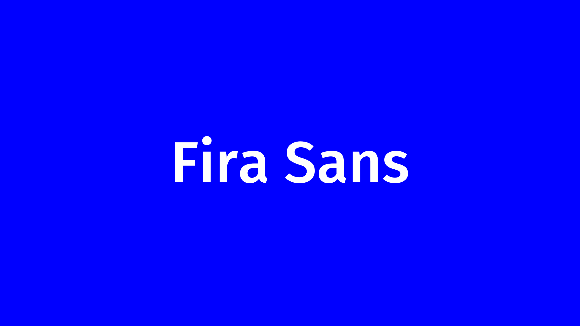
You want to ensure your audience pays attention when you’re giving a presentation. One way to do that is to choose cool fonts for presentations that will grab their attention. Fira Sans is a modern sans-serif font perfect for both body text and headlines.
It’s versatile and can be used for a variety of purposes, but it’s also easy to read on-screen. So if you’re seeking a cool font for your next presentation, Fira Sans is a great option.
Open Sans

Open Sans is one of the best PowerPoint fonts for presentations. It is a sans-serif typeface designed by Steve Matteson and commissioned by Google. It was designed with an open license in mind, which means that it may be used for any purpose.
The typeface is intended for digital displays and has a straightforward style because of its basic, tidy appearance. It’s also a versatile typeface that may be used for different purposes. It may be used in both formal and creative presentations.
Lato

Lato is a sans-serif font that was created by Łukasz Dziedzic. It has been designed to be high readable, even in small sizes. The Lato font family includes a variety of weights and styles so that it can be used for both body text and headlines.
When choosing a font for your presentation, it’s significant to consider both readability and style. Lato is an excellent option because it strikes a balance between the two. Choose this beautiful font for presentations to impress your audience.
Roboto

Google’s Roboto typeface is a clean, modern sans-serif that has been designed for use across all of their digital platforms. The clean, simple lines of the fonts make them ideal for presentations and other digital content, and the typeface also includes a variety of weights and styles to suit different needs.
Roboto is also a very adaptable typeface, and it may be used for many things. It has gained a reputation over the past few years and is now widely used on the web. If you’re looking for modern, clean fonts for your next presentation, then Roboto is a great option.
Corbel

Corbel is a professional-looking sans-serif font that was designed by Jeremy Tankard in 1995. It has a large x-height, which makes it highly legible, and its rounded corners give it a friendly appearance.
Corbel is a versatile font that can be used for both headlines and body text. In addition, its clean design makes it ideal for use in presentations and other professional documents. Overall, Corbel is a great choice for those who want a professional-looking font that is still easy to read.
Segoe

Segoe is a sans-serif font. It is a typeface that was designed specifically for use in computer interfaces. It’s become much more prevalent in presentation software such as PowerPoint and Keynote.
It’s clean and modern, which makes it a good choice for presentations that need to be effortless to read. Segoe is also a good choice for presentations that are heavy on text, as it’s easy to read at a distance. If you’re looking for easy-to-read fonts for presentations, Segoe is a good choice.
Noto Sans
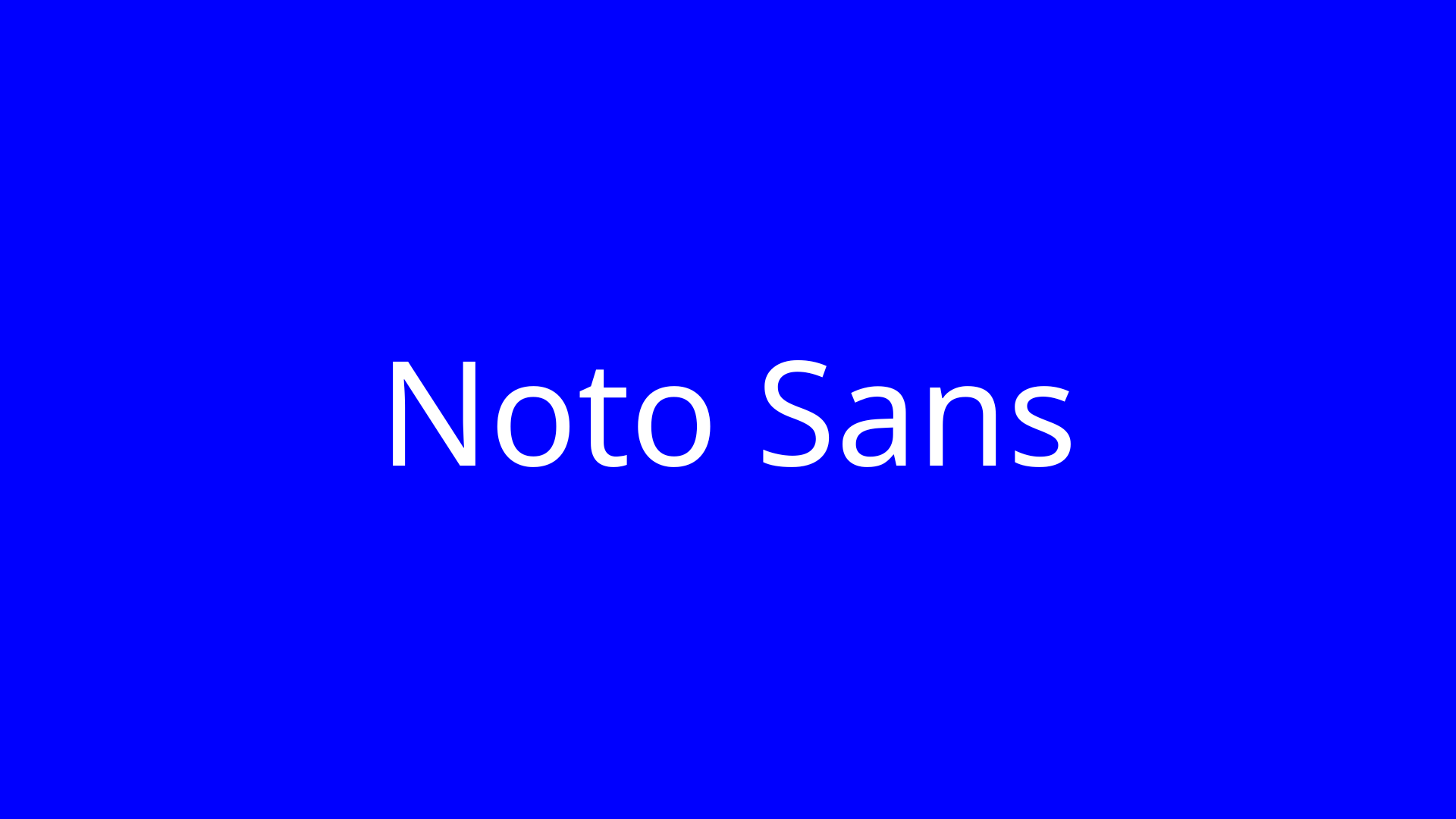
Noto Sans is a sans-serif font that provides a clean and modern look for any presentation. Its geometric shapes and simple lines make it a great choice for any situation where you need a professional appearance.
Noto Sans is also comfortable to read, even at small sizes, making it an ideal choice for PPT presentations that will be viewed on a projector or screen. Whether you’re giving a business presentation or creating a design portfolio, Noto Sans is a font that will help you create a polished and professional look.
It is a typeface that’s been designed to work well for a wide range of languages. It comes in several weights and designs so that you can match it to your presentation. Plus, it includes support for multiple scripts, so you can be sure that your audience will be able to read your slides.
Tahoma

Tahoma is a sans-serif font that was created by Microsoft. It’s commonly used in business and technical documents because it has a clean, modern look. Tahoma fonts are available in regular, bold, and italic styles.
It is an outstanding choice for documents that need to be easily readable, such as manuals or instructions. The clean lines of the Tahoma font also make it a good choice for PPT presentations and other business documents.
Whether you’re creating a PowerPoint presentation for work or school, this versatile and simple-to-read font is sure to make a good impression.
Raleway

Raleway is a sans-serif typeface family designed by Matt McInerney and Pablo Impallari. It was created as a display typeface but can also work well for body text. This versatile font can be used for corporate presentations and more creative projects.
It’s simple to understand, and it includes a slew of different characters that you may add some flair to your slides.
If you’re looking for a sans-serif font that will make your presentations look more professional, Raleway is a good choice.
Verdana

Verdana is a sans-serif font created by Matthew Carter for Microsoft Corporation. It was released in 1996 and is still widely used today. It was created to be readable at small sizes for use on low-resolution screens. It also includes features such as wider spacing between letters and larger than average letter sizes. Consequently, it remains one of the most well-known fonts for web design.
Verdana is also a popular choice for printed materials and professional presentations. Thanks to its clean lines and easy readability, it continues to be a go-to choice for designers looking for a versatile sans-serif font.
Fonts are a significant part of any presentation, but they can be especially tricky to get right. You want your fonts to be easy to read and to complement the overall tone of your presentation.
In this post, we have talked about “how to choose the right fonts for your next slideshow?” and “what are the good fonts for presentations?” Before you start creating your slides, keep the following standards in mind.